In Conversation: Pawel and Stephen Discuss Matplotlib's New-ish subplot_mosaic()
In recent years, Matplotlib introduced a new function for plotting several plots in one figure. We had a chat about `subplot_mosaic()`
There's always more than one way of achieving your desired result in Python. And this is especially true when plotting using Matplotlib, which has two interfaces and several alternatives to produce the same plot. In recent years, a new function, subplot_mosaic(), was added to Matplotlib to give the user even more options.
This article is a discussion between Pawel and Stephen as they explore this new function and compare it with older ways of displaying multiple plots in the same image.
You can follow Pawel and his Matplotlib visualisation posts (what used to be called tweets) at https://twitter.com/pawjast.
And you can read his longer posts on Medium.
Stephen:
I recall how confused I was when learning Matplotlib for the first time. I would see code in a tutorial to create a plot. And then, I'd come across different code in a different tutorial to achieve a similar plot. It took me a while to realise there are two different APIs in Matplotlib. You can either use the "pyplot" method:
In this example, I use ellipsis ... as a placeholder for the function arguments needed.
Or you can use the object-oriented approach:
This version, which is the preferred version in most cases, explicitly creates a Figure object and an Axes object. You assign the Figure object to the name fig and the Axes object to ax. Of course, you can use more descriptive variable names if relevant to your program. However, these variable names are commonly used in Matplotlib code.
The Figure object is the whole, well, figure that you're plotting, and it includes everything that's in the figure. The Axes object represents the section of the figure with the axes and the plot.
When I started using Matplotlib, I mostly used the "pyplot" approach. This is partly because it's similar to the plotting in MATLAB, another programming language I used in the past. However, I have now shifted to using the object-oriented approach almost exclusively, not only because it's the recommended API, but also because it feels more Pythonic.
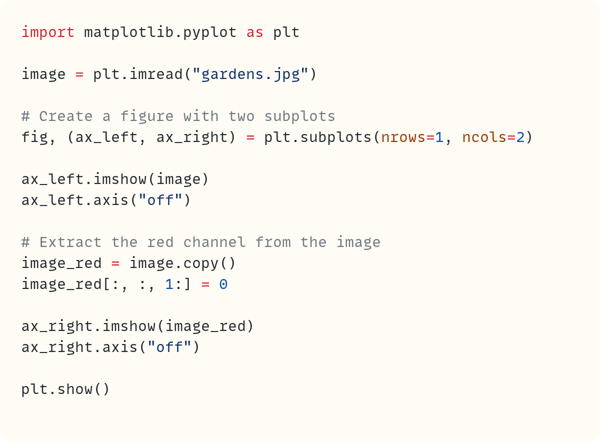
The object-oriented approach also makes creating a figure with more than one set of axes more intuitive. Here's an example showing two plots side-by-side within the same figure. I'll use the image file gardens.jpg in this example:
Once you read the image from the JPG file, you create a figure with two axes instead of one. The Figure object is assigned to fig as in the previous example. The tuple (ax_left, ax_right) allows you to assign the two Axes objects to these variable names.
You define the number of subplots, which is the number of separate sets of axes, by adding the nrows=1 and ncols=2 arguments in plt.subplots().
Once you've created one figure with two sets of axes, you can plot using each Axes object separately. Here's the figure produced by this code:
But now, there's a newer way of doing this. And for more complex plots, it can make your code easier to write and read. And both of those points are important. Here's the same plot using subplot_mosaic():
You use plt.subplot_mosaic() instead of plt.subplots(). The argument in plt.subplot_mosaic() is a two-dimensional array (2D). In this example, there's only one row and two columns, but you still need to use a 2D array. This is a list within another list.
This 2D array represents the subplots and their placement in the figure. We'll discuss some more complex examples later on.
I'm so used to the original system of using plt.subplots() for plotting figures with several axes that I found it hard to adapt to using the new subplot_mosaic() function. But I'm trying to change my habits now!
Pawel:
One of the "Zen of Python" principles states:
There should be one-- and preferably only one --obvious way to do it.
And yet Matplotlib seems to go against the grain with their two plotting interfaces (plt. and OOP approach) and multiple ways of creating plots and figures. Stephen's initial confusion was and still is shared by many wanting to learn about Python's number 1 plotting library.
Therefore, the question is:
Why is Matplotlib muddying the water by adding yet another method for creating figures and axes?
Stephen has already provided some hints that might constitute the first part of the answer. Here's the "Zen of Python" again:
Readability counts.
To demonstrate the point, let's re-work the previous example.
I've created a 1x2 figure again. But this time I didn't unpack the axes to the individual variables (which is a fairly common practice).
The updated code looks as follows:
This is manageable. However, the code's readability drops significantly as I keep adding more axes, especially when they span multiple rows and columns.
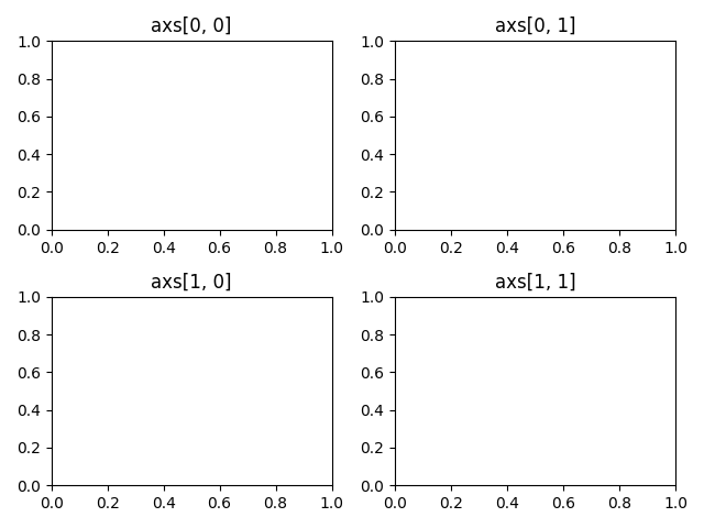
For those of you who don't immediately recognise the structure, the indices in the code above correspond with the respective spaces in a figure:
Now, let's re-write this example and use the plt.subplot_mosaic() to create figure and Axes:
Based on the above, I think it's fair to say that:
creating multiple
axesis more intuitiveusing the newly created
axesis more human-friendly as we access them by name and not by index
This is good, but surely there must be more to it. Even if important, the readability alone is not a sufficient reason to introduce another method.
So, what else have we gained with the new method?
It turns out there's another key aspect of creating gridded layouts that was massively simplified by introducing plt.subplots_mosaic(). I'm talking about the scenario where one or more subplots span multiple rows or columns.
Let's consider the following example:
I'm not even entirely sure the plt.subplots() is capable of creating such a plot. I would probably need to resort to a more explicit way of creating this complex layout.
Using plt.subplot_mosaic(), on the other hand, makes the job dead easy:
Stephen:
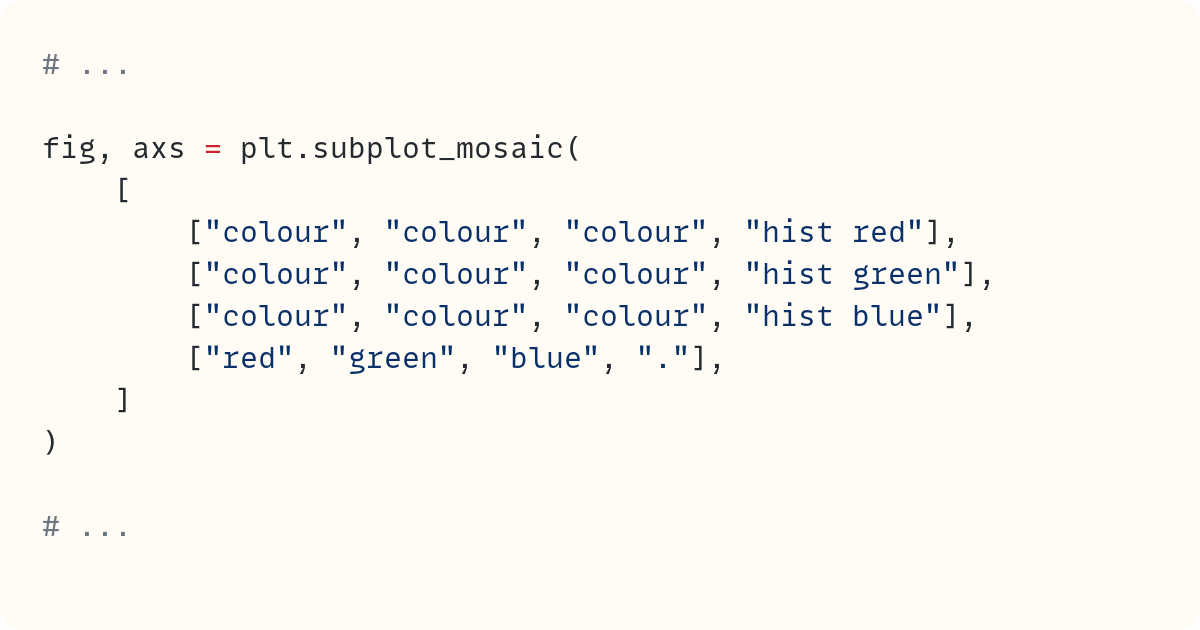
Inspired by Pawel's example, I'm keen to try this out with the image of the Singapore gardens I showed earlier. I'll start by showing the full-colour image as a large image and the red, green, and blue components as smaller images below. I'll set this up as a grid with four rows and three columns. The top three rows are reserved for the full-colour image, and the bottom row is for the three separate colour channels:
The outputs from the print() functions are shown as comments. The variable name axs now refers to a dictionary which contains four Axes objects. These axes are labelled with the strings I used when calling subplot_mosaic(). This means that only four subplots are created, not 12!
You'll see the configuration created when you run this code. It doesn't look pretty, but we'll fix this soon:
So now, I can place the full-colour image in the axes labelled "colour":
This places the full-colour image in the large section which occupies the top three rows of our 3x4 grid:
And finally, I can place the separate red, green, and blue components of this image in the bottom three plots:
I've kept the separate channels as 3D arrays but replaced the remaining layers with zeros. For example, the red channel is a copy of the original image with the second and third layers replaced by zeros. Here's the output from this code:
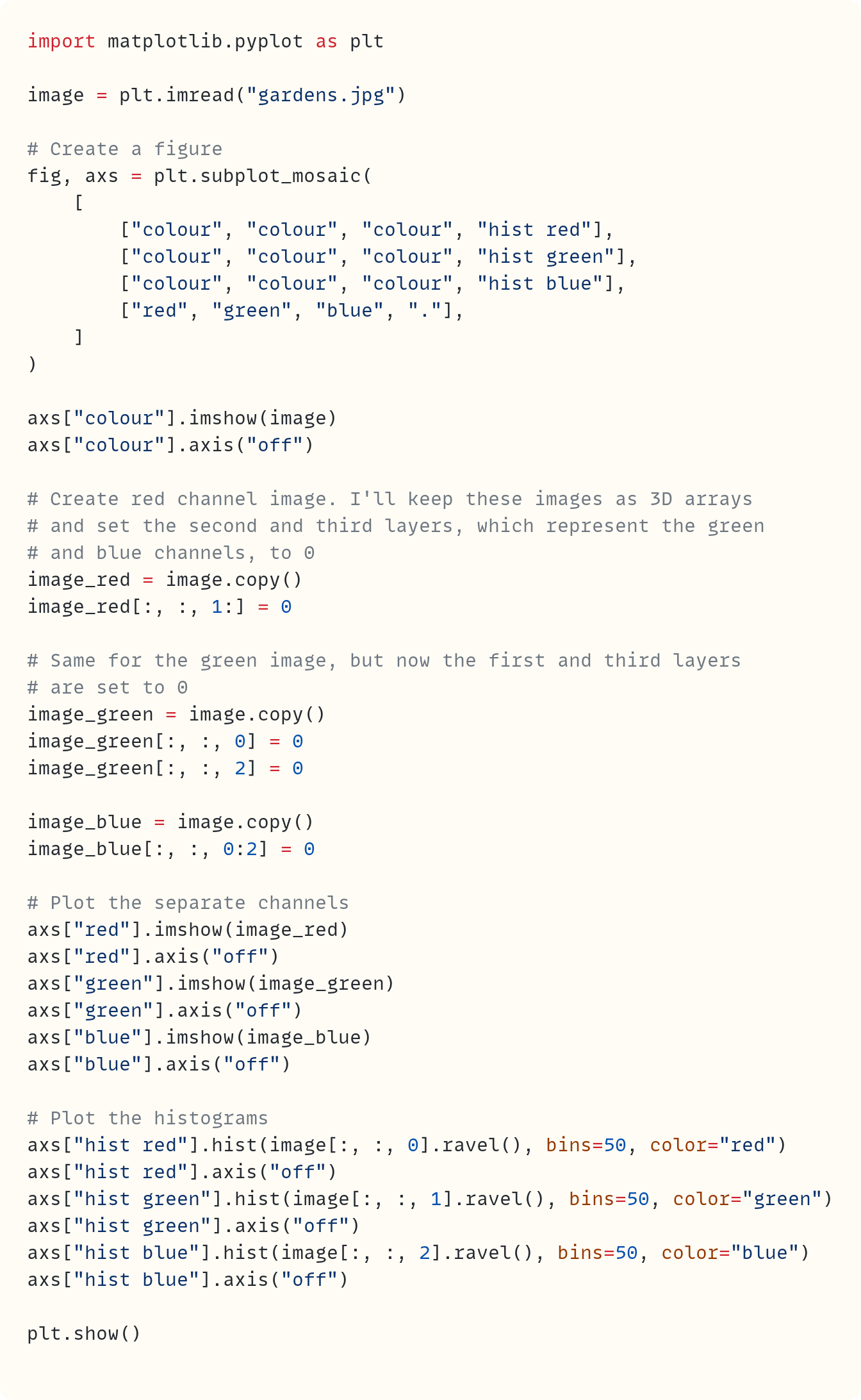
But I'll go a step further and change the mosaic into a 4x4 grid. I'll add the histograms of the three channels in the fourth column. Here's the complete code:
Did you spot the "." in the list of lists I used as an argument for subplot_mosaic()? It indicates that there's no plot in that location. So, the bottom-right spot in the 4x4 grid remains blank. There are only seven Axes objects created. They are the ones with the following labels:
"colour""red""green""blue""hist red""hist green""hist blue"
You can confirm this using print(len(axs)) which returns 7.
I'm using NumPy's ravel() function to flatten the 2D array representing each channel. This is the final figure created by this code:
To return to Pawel's point, subplot_mosaic() makes this code more readable since we can refer to the axes by a well-chosen label, such as "hist red" and "colour". It also makes creating these types of grids of subplots relatively easy.
Pawel:
Stephen has quietly introduced the concept of the empty sentinel (the dot: .). An empty sentinel is the spot in the grid of subplots that will remain empty. By default, it's the dot: ., but it can be changed to any character (I'll demonstrate this in a second).
By now, we've provided enough evidence to show that the new subplot_mosaic() is intuitive for writing (and reading) the code and allows for the easy creation of complex grid plots.
Speaking of complex grids, if meaningful axis names aren't your priority but you still want to create them quickly, it’s possible! One way to create a grid is by using a 2D array. However, there's another way. The same can be accomplished with a string.
The first parameter in the plt.subplot_mosaic() is mosaic, and as mentioned earlier, it can be either a 2D array or a string. If it's a string, the only caveat is it has to be one character per row and per column created.
Stephen's latest example goes like this:
Let's re-write it using the string as a mosaic:
Therefore:
acorresponds tocolourb,canddcorrespond to the histogramse,fandgcorrespond to the red, green and blue channels
The axis names aren't as meaningful, but it is generally a faster way of creating complex grids. And it is still easier than using the previous interface, .add_subplot().
Let's look at one more layout that would be awkward to create with the 2D array approach but is fairly easy with the string approach.
We'll create a 3-row grid with:
5 columns in the first row
3 columns in the second row
1 column in the third row
Plotting:
Output:
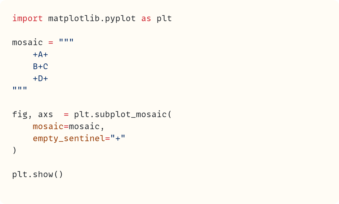
Now, back to the empty sentinel. I've mentioned earlier that it doesn't have to be . and you can use another character if you fancy it. Let's use + in the next example. All you have to do is declare a new value with the empty_sentinel parameter:
This will produce the following grid:
We've covered a lot of ground already, and I've just realised that there's one thing which is perhaps not immediately obvious. We always unpack the output of the call to fig and axs, whether we use plt.subplots() or plt.subplot_mosaic(), as it's practical and uniformly understood within the Matplotlib community. However, axs refers to different data types in these two use cases.
When you run fig, axs = plt.subplots(1, 4), the axs variable is a list of Axes:
array([<Axes: >, <Axes: >, <Axes: >, <Axes: >], dtype=object)When you run fig, axs = plt.subplot_mosaic("ABCD")), the axs variable is a dictionary of Axes:
{'A': <Axes: label='A'>,
 'B': <Axes: label='B'>,
 'C': <Axes: label='C'>,
 'D': <Axes: label='D'>}
Why do I even mention this? It's because another common practice when working with multiple Axes objects is to iterate over them in a for loop. For example, you might want to set a title to all axes in one go.
In case of fig, axs = plt.subplots(...) you'd do it like this:
However, in case of fig, axs = plt.subplot_mosaic(...) you'd have to slightly modify the call:
Or use a dict method to access its elements:
It's a small detail that's worth remembering, especially if you're used to the plt.subplots().
Stephen:
You make some great points about the difference in the objects returned by the two functions. I'm sure we'll trip on this from time to time as we switch between using plt.subplots() and plt.subsplot_mosaic().
I like the flexibility this new function offers and it's certainly a great new tool in the Matplotlib toolbox!
It's been great discussing plt.subplot_mosaic() with you, Pawel. I feel I understand it better now and will make an effort to start using it more!
Pawel:
Thank you for inviting me to the discussion Stephen! It was fun but more importantly it made me review all I know about plt.subplot_moasic() and even go deeper to understand some lesser known aspects of it (e.g. using custom *empty sentinel*).
Code in this article uses Python 3.12
subplot_mosaic() was added to Matplotlib in version 3.3 provisionally and then as a stable feature in version 3.7. You can find the documentation for the function here: https://matplotlib.org/stable/api/_as_gen/matplotlib.pyplot.subplot_mosaic.html
You can follow Pawel and his Matplotlib visualisation posts (what used to be called tweets) at https://twitter.com/pawjast.
And you can read his longer posts on Medium.












Thanks for inviting me to this co-writing project. It was a real pleasure and I hope it's only the first of many articles we'll write together in the future :).